Analyzing the CityBus Service
In collaboration with KeyLime Interactive, a team of my peers and I investigated the physical and digital painpoints of the CityBus user experience. This project was done as part of coursework.
About the project
Date:
Jan-May 2024
Client:
KeyLime Interactive
Services:
UX Research, UX/UI Design
Phase 1: Analyzing User Behaviors, Feelings, and Experiences
The primary goal of this project was to establish the current user feelings and behaviors surrounding the CityBus service, so research objectives were created and then different research activities were developed and executed based on our objectives.
Observations
Firsthand observations were conducted on the CityBus service for the team to develop a deeper understanding of the service and how its different components interact in the natural environment.
Photos and other evidence of possible painpoints were gathered for further review.
An example of one such observation that was made can be found to the right; the image shows an issue of lack of information on signage that was looked into later.

A CityBus sign, with a message taped to it telling users to check the the app for accurate route information.
Social Media Review
Social media was used as a primary source of information about user feelings and opinions expressed on social medias like Reddit were documented and analyzed. Below are the key findings from this activity.
App Performance
Many of the complaints found about the CityBus service fell into the category of app performance.
The live tracking feature was frequently criticized for providing incorrect information about bus departure and arrival times, causing some users to miss the bus.
The live tracking feature was found very useful and helpful when information about bus departure and arrival times were accurate.
The CityBus app has been completely unusable due to an undeclared issue in previous instances.
Physical Bus Touchpoints
The lack of signage and shelters at some bus stops were frustrating to users.
No major painpoints were uncovered regarding the buses' physical exterior or interior.
These results revealed a need to explore the app's usability further, which was accomplished with usability testing on the CityBus app.
Usability Tests
Usability testing was conducted with users due to the high volume of app complaints found in the social media audit. Participants were asked to complete common tasks, such as finding the current location of a bus.
Key findings include:
Users experience information overload on the home screen (left screen)
The hamburger menu is the only means of backtracking, frustrating users
Users liked the live tracking map (right screen) and used that screen more often than the home screen, though it has its own issues as found in the social media review

The MyCityBus App's homepage, showing route information and times.

The MyCityBus App's map page, showing a bus's route and location.
All painpoints and insights from this phase were collected and organized into a simple but informative journey map, which can be seen below. In the next phase, the painpoints from this journey map will be analyzed and prioritized to uncover overall key findings, provide recommendations on alleviating the most severe and frequent painpoints, and optimizing the remaning time to design.

Phase 2: Analyzing and Prioritizing User Painpoints
Understanding Painpoint Frequency and Severity
A survey was conducted in order to prioritize the most severe and/or frequent painpoints we found for design and recommendation.
Survey
CityBus users were asked to identify the frequency and severity at which they experienced a set list of painpoints on a Likert scale while using the CityBus service. An optional open ended comments box was provided at the end for users to explain further anything they felt strongly about. After 100+ responses, the survey was closed and and results were coded and analyzed. Below is the analysis chart for frequency of experiencing painpoints.

An analysis of the survey responses showing frequency of painpoints.
The prioritized painpoints are as follows:
Incorrect app times for bus arrival and departures were a severe and frequent problem experienced, especially frustrating in inclement weather.
Buses outfitted with manual doors are very difficult or impossible for some users to push. Other users did not recieve signals they needed to push them the first time they rode the bus.
Buses running late or early caused frustration, again being most frustrating in inclement weather.
Previous data on these prioritized painpoints was identified and gone over again in the next phase to provide data-backed recommendations. Design recommendations were visualized in the next phase.
Phase 3: Recommendations & App Redesign
Recommendations
Recommendations for improving the CityBus's experience through addressing the three prioritized painpoints given above were given in a meeting with sponsors so any questions or inquiries about justification may be addressed in real time. Summarized recommendations for each painpoint are given below.
Incorrect App Times
Consider investing in improving the GPS system that links the buses' physical location to the app's timing system.
Hard-to-Push Manual Doors
In the long term, continue to move towards using buses with automatic doors. In the short term, provide signage on manual doors instructing users to use force to open them.
Late or Early Bus Arrivals and Departures
In the long term, conduct research into why buses may arrive or leave significantly early or late, and consider allocating resources to a potential solution. In the short term, it is understood by CityBus users that buses may arrive or depart slightly early or late. Outside of this particular threshold of grace, users should be notified ahead of time when a scheduled time changes significantly. A push notification of which routes and bus stops are affected would give users notice and an ability to change their plans.
App Redesign
The prioritized painpoints mentioned above demanded solutions beyond the power of the team and the project. However, within the team's power was to make redesigns to the app to support users where it was possible. To reduce the friction users might experience while first using our redesigned app, designs were kept similar to the previous app interface.
The Map Screen
The map screen was a screen commonly mentioned in research. Users rely on this screen to see where their bus is in real time. Some users reported using this screen more than the home screen. Due to the importance of the screen, it was prioritized to be redesigned to address user painpoints.
Issues with the Map Screen:
The semi-transparent routes tab led some users unable to read the information on the tab due to low color contrast.
The sliders were unclear to users. Were they pointing to the route's destination or at the beginning of the route?
The sliders were also hard to see for some users.
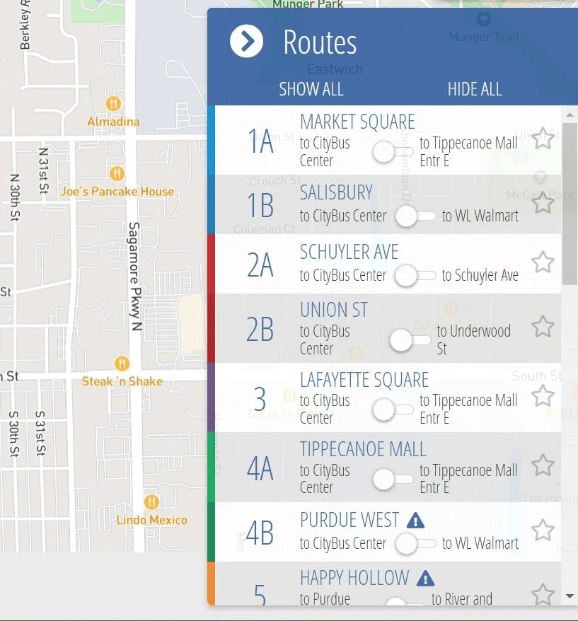
The routes tab, showing route numbers and name, along with a slider to change the direction of the route.
My Solution

The solution developed addressed these issues, by making the background of the routes tab opaque and coloring in the sliders with their corresponding route's color. Arrows were also added inside the circle of the sliders to show that the side the circle was on was the destination of the route.